Both coffee and printmaking (“printing”) have found their way into my life a long time ago. I still remember lazy afternoons at my best friend’s home during our teenage years, drinking strong Turkish coffee from tiny cups and eating dessert. Once done with coffee, we would invert our cups and leave them briefly on their saucers to drain. The real fun would start after that: we would “read” our fortunes in the patterns of coffee grounds still left in the cups…oh the lives we imagined!
So, when an art opportunity showed up a couple of months ago to ‘combine’ coffee and printing, I couldn’t pass it up. I also wanted to finally use some of the textile art supplies that have been sitting unopened for several years in my basement; as you can guess, I absolutely had to have them at the time…
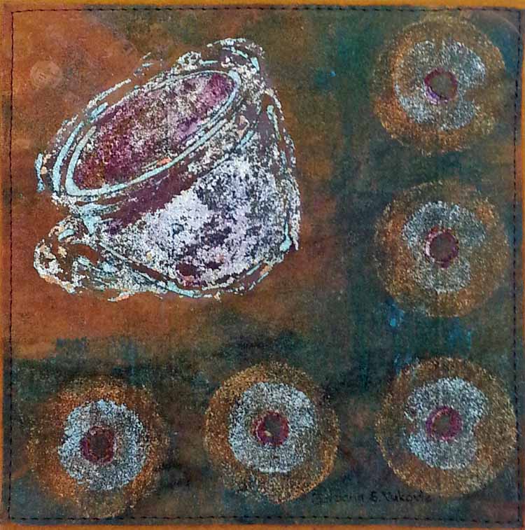
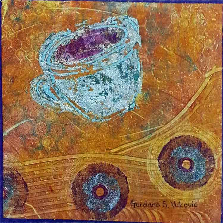
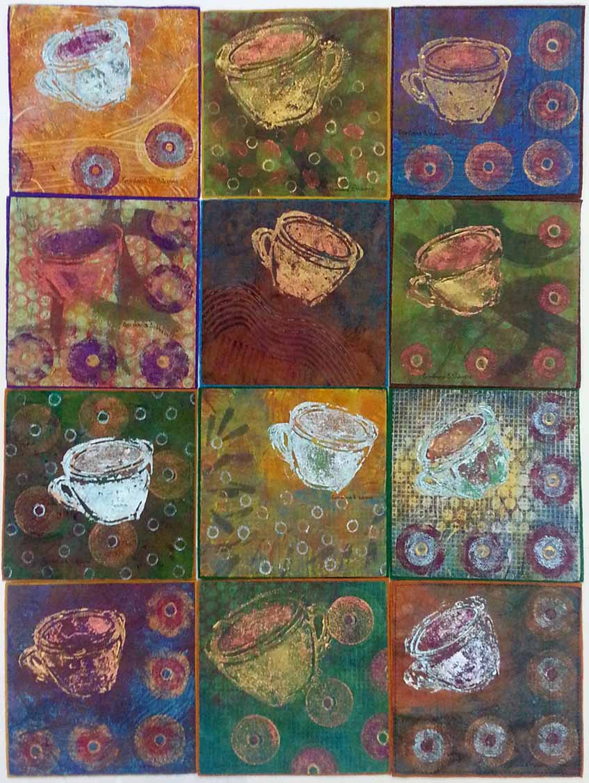
Through the initiative of Virginia Spiegel, an artist and person extraordinaire, a group of 21 artists participated in the Intentional Printing Java Art Exchange. Each of us had to make from two to 12 small art works for exchange, primarily from textiles and with almost complete freedom regarding their design. We were also expected to apply at least three printing techniques from the recently published book by Lynn Krawczyk,”Intentional Printing: Simple Techniques for Inspired Fabric Art.” Our pieces were to contain at least one image of a coffee cup from the book – identical or similar to it.
I hear you asking right now, “What is Intentional Printing?” It is best if I quote Lynn:
Making fabric with the hope that it might work in a piece of artwork felt like a waste of time and resources. I needed to make fabric for a project. And so intentional printing began.
…
The goal became clear: to construct a way of working that gave me more control in the art-making process without strangling the creative groove and to pick a facet of surface design that I truly loved and see how far I could push it.
— “Intentional Printing” by Lynn Krawczyk
Now is the time for you to grab a cup of coffee or tea, get comfortable, and prepare yourself for some lengthier reading. There are plenty of pictures included as well to prevent you from falling asleep!
Planning
I decided to contribute the maximum allowed number of pieces as to have ample opportunity to bring my rusty printmaking skills in shape. I wanted to practice techniques and designs on paper first, and then to move onto textiles.
I planned to make all of my art works different, merely because it never occurred to me to make 12 identical ones. I intended to start with white and natural color cotton textiles, to print and paint them, and then to add some hand and/or machine stitching.
Preparation
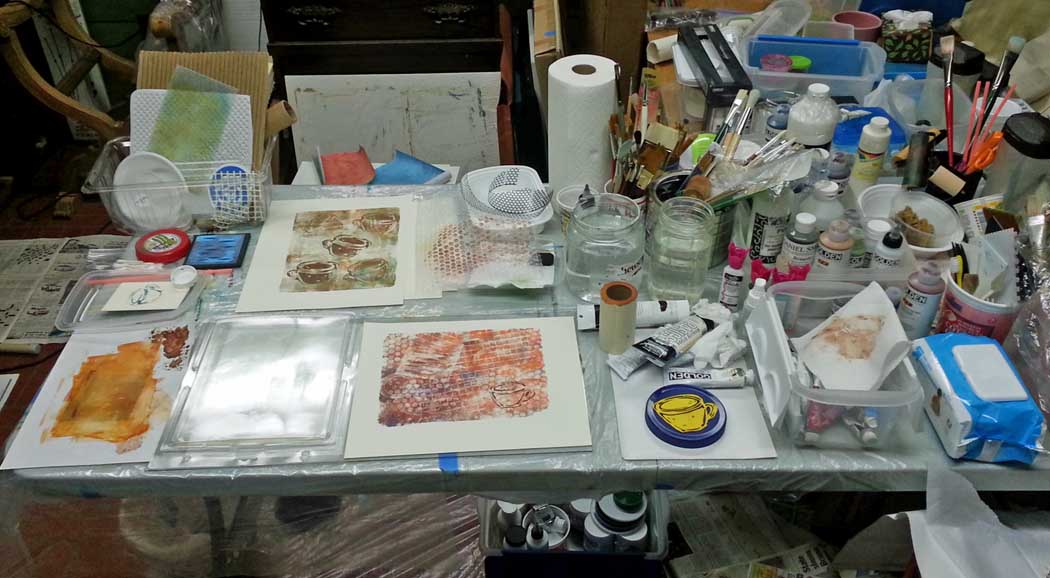
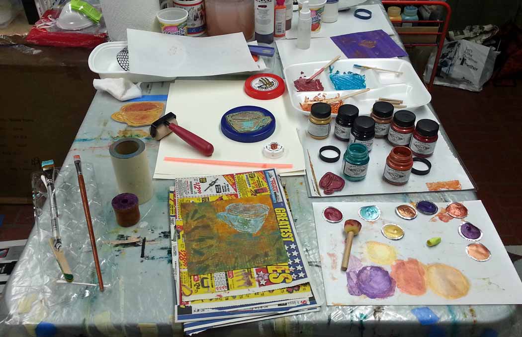
Not surprisingly, my initial supply list kept growing. In the end, I assembled the following items for test runs: various papers and cotton textiles to print on, acrylic paints and mediums by Golden and Liquitex (including retarder and GAC 900 fabric painting medium by Golden), textile paints (Pro Chemical&Dye paints, as well as Dye-na-Flow and Lumiere by Jacquard), textile markers, regular and foam paint brushes, sponges, brayers, and various texturing tools, including the home-made ones (corrugated cardboard, cling wrap, bubble wrap, and other scraps that we usually recycle or throw away).
I ordered a gel printing plate by Gelli Arts that I wanted to try for some time. I also cut a few tools for making a print of the required coffee cup image – a stencil from a transparency film and stamps from each of the following materials: sticky-back-foam sheet, Timtex, and Peltex.
Practice Runs on Paper
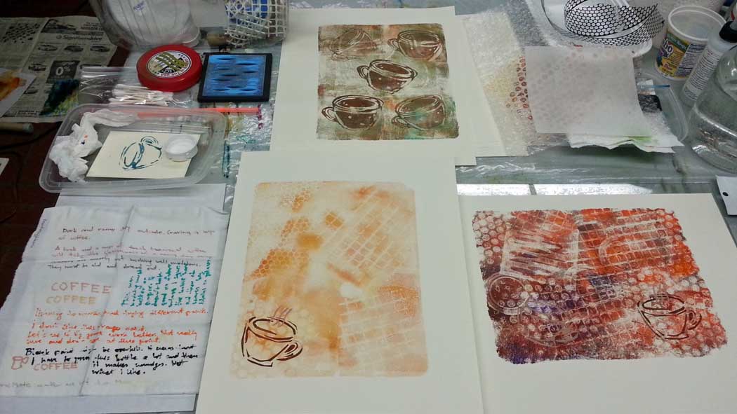
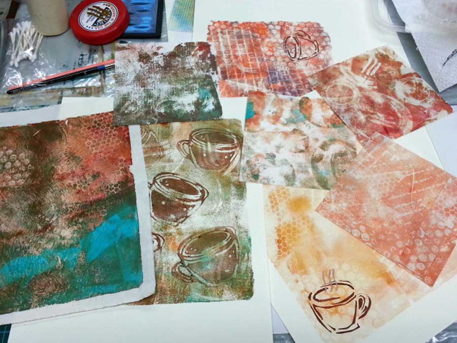
Printing with gel plate was easy, quick, and fun. I was mixing fluid and regular acrylics to get the paint mixture of the right viscosity for printing on paper. Eventually I started adding acrylic retarder in various ratios to simplify the process, save time, and get better prints.
Practice Runs on Textile
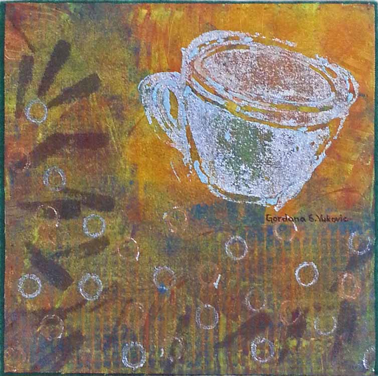
Switching to textiles required adding fabric medium to paint and playing some more with the paint viscosity. I was not aiming for the perfectly crisp print but rather for a print that would be a great background for the stitch work later. I liked the best the coffee cup image made by the sticky-back-foam stamp and decided to have only them in my final runs.
After trying different brand markers for textiles, I have yet to find the one that I really like. I had similar experience with paint in squeeze bottles: I don’t like the quality of lines they make, either thick or thin ones; it might be that I have to try again with different paints.
Reality Check
After printing on a few white and natural-color muslin pieces of gel plate size (8”x10”), the following became obvious:
- If I continued making pieces that way, I would have finished past the deadline.
- I really liked the look of the whole pieces and didn’t want them cut to required size (6”x6”). Instead, I saw them either further developed into resolved works or combined together into larger art pieces.
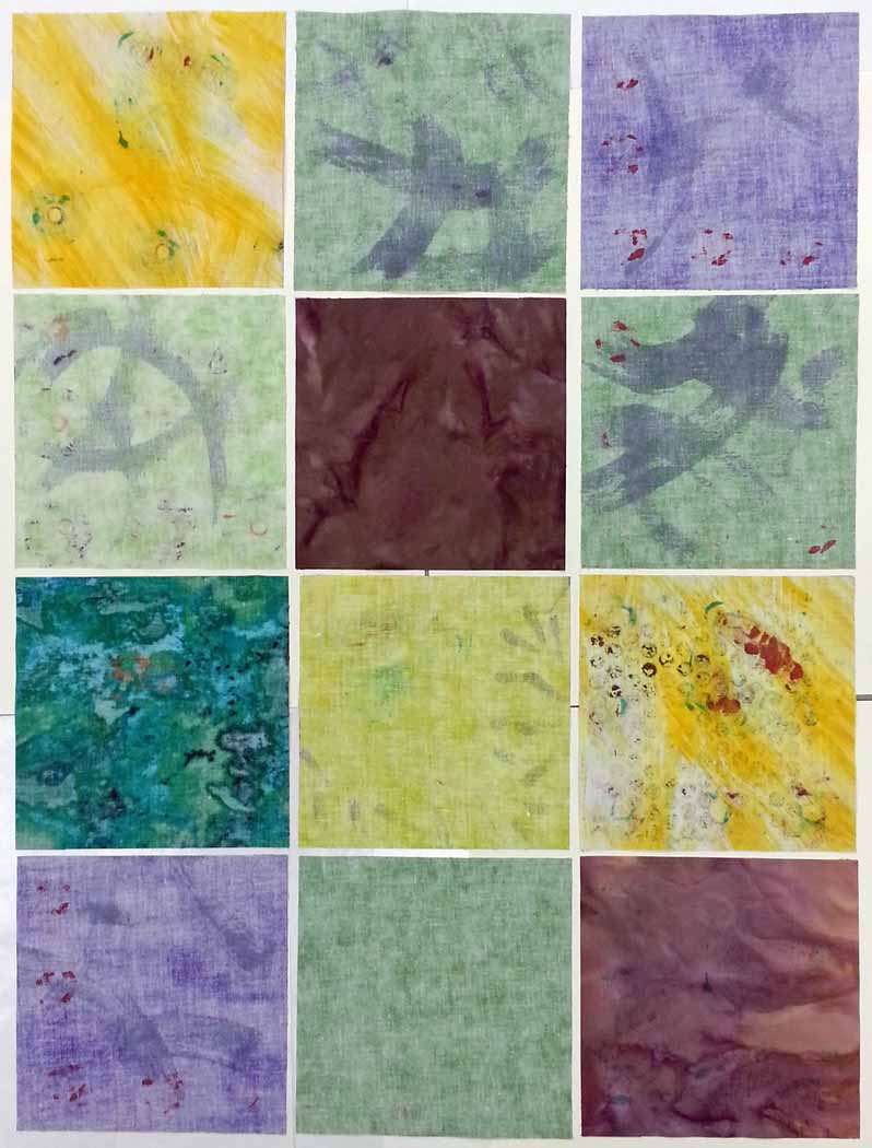
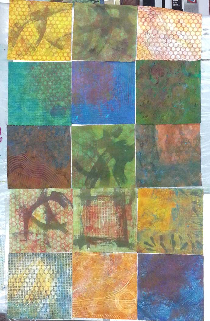
Therefore, I changed my original plan. I decided to use commercial textiles that were already colored but didn’t have any highly discernible designs on them. I got lucky going through my textile stash: several years ago I inherited a bag of cut-up textiles that had enough pieces of exactly the right size and look.
Final Runs on Textile
Once the final decisions were made, everything else fell into place. I did have to solve additional logistics problems along the way; using just a portion of the gel plate – to get the print of the required size – and finding the right stamping tools for additional design shapes were just two of them. But, for the most part, the printing process involved ‘listening’ to the colors and textures, and quickly ‘going with the gut’…before the paint dried out!
Finishing Touches
Luckily for me I ran out of time for printing and had to wrap everything up. Otherwise, I would’ve had hard time stopping on my own – it was that addictive!
When I looked at all the printed works spread out together on my work table I felt that each of them needed to be ‘framed’ with a tiny bit larger piece of felt (6.25”x6.25”) of the right color: the felt would give it firmness and let some colors pop up. So, I did that, created felt backgrounds. After I stitched the first printed piece to a felt square by my old, reliable Bernina sewing machine, I decided to do the rest of them by hand because I liked that look better; besides, I find hand stitching calming and meditative.
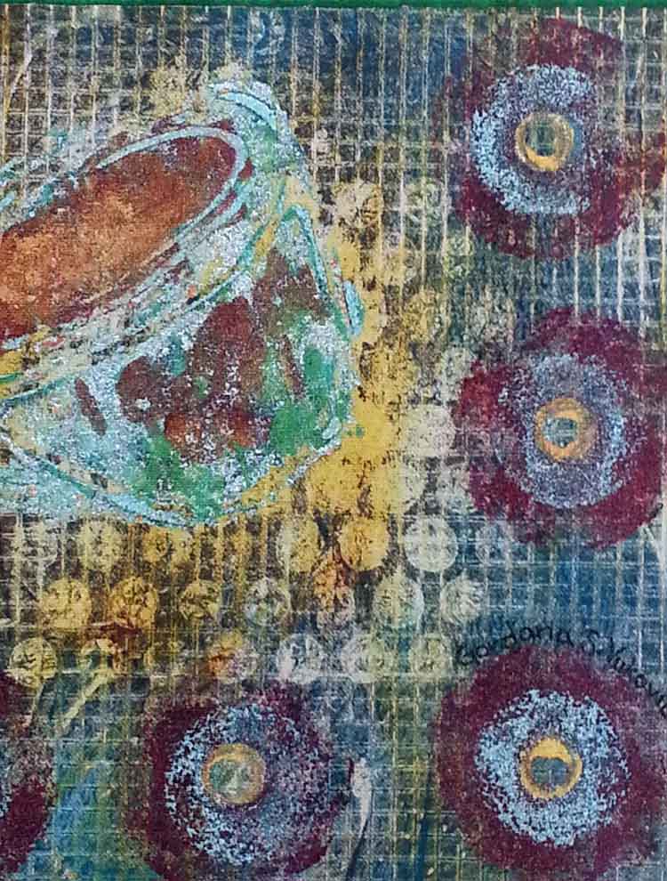
My original plan called for some additional hand stitching throughout the body of each piece. I did it sparingly on a couple of pieces but didn’t find that stitching added much value to the overall look – bright Lumiere metallic acrylic paints overpowered any stitching, even with metallic threads. In the end, I decided to leave the rest of the pieces as they were, to speak through their printed texture and color.
And then it was time to send my pieces to their new homes…
Parting Words
I truly enjoyed participating in our art exchange. I ‘met’ a wonderful group of artists whose work is beautiful and inspiring. The printed pieces I received will always remind me of the artists’ personal warmth and creativity. I hope that Virginia organizes more projects like this in the future, collaborative and/or art exchanges; I will join them for sure.
If not for this art opportunity, I don’t know when I would have read Lynn’s book. It was serendipity that I got hold of it right at the time when, on my own, I came to conclusions about my general art process that were close to Lynn’s printing experience:
Intentional printing is about slowing down and looking beyond the mechanics of how to print pattern on fabric. It’s about discovering your intention toward your art by slowing down, getting to know what you love, and embracing the techniques that you learn to create your own art. It’s permission to go inward and focus on the aspects of your art that speak your truth the clearest. — “Intentional Printing” by Lynn Krawczyk
Lynn’s words were confirmation of my personal discoveries and the Java Art Exchange couldn’t have happened at the better time. Ever since then I have been busy experimenting in the studio and getting more at ease with my art making.

Love your blog on the Java Exchange! I was one of the participants too, and although I did not give to nor receive from you, I love what you made!!! Thanks for sharing.
Thank you, Jay. We will have more chances to exchange work, I am sure.
Beautiful and informative post, Gordana! So glad you could participate in the exchange.
It was a wonderful experience, Virginia! Thank you for making it happen.
Thanks so much for a wonderful story/timeline of your “Intentional Printing” experiences and the Java Challenge . Very pleased to have one of your pieces (#1) in my collection ready for display in my newly painted kitchen… salute!!
Bethany in Kingston, ON
My pleasure, Bethany. I hope to get one of your works next time!
Gordana,
This was most interesting and your description of methods and work progression was easy to follow……unlike at the exhibits out here in WA. I love the finished work.
Keep it up, Lola
Thank you, Lola, you are too kind. It takes a long time to write a post about the whole process, even if I wasn’t as painfully slow writer as I am.
As expected, artists typically get caught in the process of creating art; they’d rather be doing that without interruptions to take supporting pictures/video/…and the paint dries relatively quickly too! In the end, if there are not enough photos to support the writing, the post ends up too long to read. Like my reply. 🙂
You mentioned wanting to create a nice line with paint. I love working with dyes. For a black line I squeeze thickened dyes through a nib on a bottle. This works well.
You are absolutely right about thickened dye, Eileen. And you use it beautifully in your textile art.
For Java Art Exchange I wanted to use supplies I had ready at home and dyes were not among them. I just have to play some more with paints to get the right viscosity; maybe even to add a little bit of acrylic ink, if needed.
I wonder if you could apply acrylic ink with a dip pen. I find it is the lack of a variety of line quality that I don’t like using commercial textile pens.
I believe it should work well, at least if we write over the painted (acrylic based) areas – Lisa Engelbrecht makes beautiful art that way.
Yours was so special ! Great post!
I’d love to be able to do some more swaps one day!
Looking forward to the next swap, Marie!
Gorgeous Java series Gordana. How could you bear to swap them? Did you get 21 works in return?
Thank you, MP. You are right, it wasn’t that easy to see them go; it helped a little that I ended up with one extra piece that I kept for myself.
I did get the same number (12) of beautiful art works from the other artists. They are not framed yet, but they already hold a very special place in my heart.
Beautifully done. Great post! Love your process. I have the pieces I received still sitting waiting to be photographed for my blog post. Glad to find your blog. I’ll be following you now.
Marissa
Thank you, Marissa. Let me know when your blog post is up.
Incredible Gordana! Your work is just beautiful and I’m so glad to have received one of your pieces in the trade! 🙂
Thank you, Lynn, it was a wonderful experience. It happened only because you wrote a lovely book!
Hi Gordana, This is a great set of prints that you’ve created. I’ve recently purchased a couple of Gelli plates and have been having a great time making prints and collages. next I will try fabric, so this is a good post for me to read. I also got Lynn’s book as an ebook and am reading it slowly to let the words sink in.
Thank you, Michele. I am not surprised that you also caught the printing bug, enjoy!